
Appearance
Custom Controls in the Control Panel
The Custom Control tab (🎚️ Controls in Simple Mode) lets you pin any numeric parameter from the Inspector directly into the operator's view — no code needed. Pinned parameters become live sliders or number inputs that any operator can adjust from the Control View without touching the composition editor.

Why Use Custom Controls?
- Expose only what operators need — instead of handing someone the full editor, give them a clean set of labelled knobs.
- Change values live — adjustments fire to the engine immediately, with no need to stop playback.
- Share across the network — the Control View is a web page; any browser on the venue network can adjust the same controls simultaneously.
Pinning a Parameter from the Inspector
Any parameter shown as a fader (slider), number input, or number pair in the Inspector can be pinned to the Control Panel.
Step 1 — Select the clip or layer
Click a clip in the Timeline (or a layer in the composition canvas) to show its properties in the Inspector on the right.
Step 2 — Find the parameter
Locate the parameter you want to expose — for example Opacity, Volume (dB), an effect's Brightness, or another live effect value.
Step 3 — Open the parameter's options
Click the small link icon (🔗) that appears to the right of the parameter's label. A tooltip expands with the 📌 Panel option so you can add or remove the parameter from the Control Panel.
Step 4 — Click "Add to Control Panel"
Switch to the 📌 Panel tab and click Add to Control Panel. A toast notification confirms the action:
📌 Added to Control Panel!
The parameter immediately appears as a control item in the Custom Control tab of the Control View.
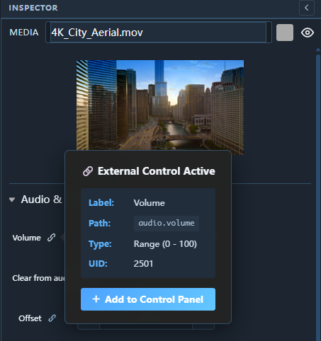
Tip: The button toggles. If the parameter is already pinned, the button shows Added to Panel with a ✓ checkmark. Click it again to remove the parameter from the panel.
Control Types
The control widget that appears in the Custom Control tab depends on the Inspector component you pinned:
Range Slider (Fader)
Pinned from a Fader component (e.g. Volume, Master Brightness, Opacity).
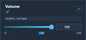
- Drag the slider or type a value in the numeric field.
- The min / max range is inherited from the Inspector parameter definition.
- Step size defaults to
0.1.
Number Input with +/− Buttons
Pinned from a DraggableInput or InputPair component (e.g. X/Y position, pixel offsets, integer values).

- Click − or + to step the value by the parameter's
stepamount. - Type directly in the field for a precise value.
Renaming a Pinned Control
By default, the control label is derived from the property name (e.g. "Brightness", "Volume"). To give it a more descriptive name:
- In the Custom Control tab, click the label text of the control.
- It becomes an editable text field. Type the new label (e.g. "Stage Brightness" or "Lead Mic Level").
- Press Enter or click elsewhere to save.
The custom label is stored in the project and persists across sessions.
Removing a Control
| Method | How |
|---|---|
| From the Control Panel tab | Hover over the control → click the × icon in the top-right corner |
| From the Inspector | Click the 🔗 icon on the parameter → Panel tab → the button now shows "Added to Panel" → click to remove |
| Clear all | In the Custom Control tab header, click the Clear All (🗑) button to remove every pinned control at once |
Adding a Pinned Control to a User Panel
Pinned controls in the Custom Control tab can also be pushed to a User Panel for end-user access:
- In the Custom Control tab, hover over a pinned control.
- A small + icon appears.
- Click + and select the target User Panel from the drop-down.
The control now appears in both the Custom Control tab and the chosen User Panel.
Tips
- Group related controls by renaming them with a prefix (e.g. "Act 1 — Brightness", "Act 1 — Volume").
- Live changes are instant — the engine receives the update on every slider movement; no "Apply" button needed.
- The Custom Control panel is shared across all browser sessions connected to the same engine. If two operators adjust the same slider simultaneously, the last write wins.
- Controls are saved in the project file and reload automatically when the project is reopened.