
Appearance
User Panel Builder
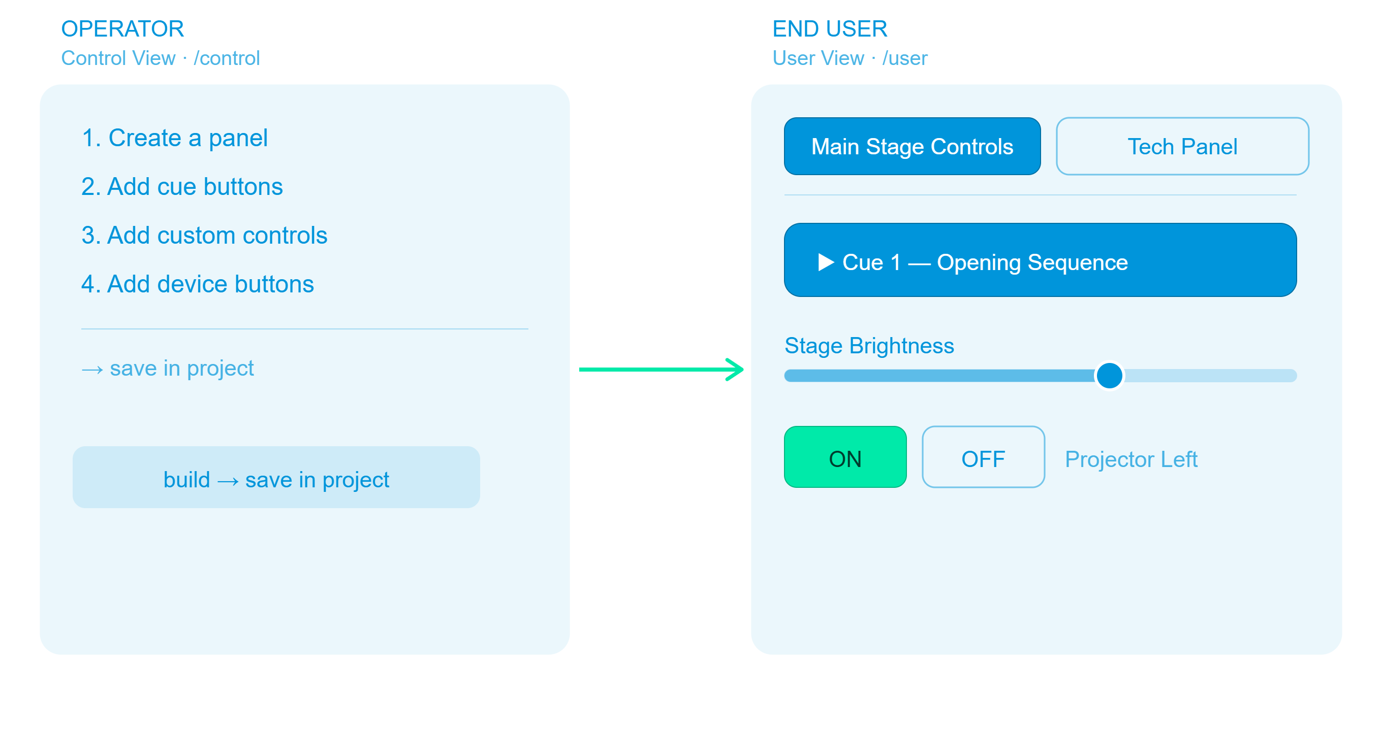
The User Panel Builder — also called the User Panel Designer — lets operators create custom, branded control pages for end users — stage managers, directors, AV technicians, event hosts — who need to trigger cues or adjust parameters without access to the full editor.
Every panel is a named, colour-coded page that appears as a tab in the User View (/user). Operators build panels in the Control View; end users interact with them on any browser.
How It Works (Overview)
Step 1 — Create a Panel
- Open the Control View (
http://<engine-ip>:8123/control). - Click the 🎨 User Panels tab.
- Click + Create Panel.
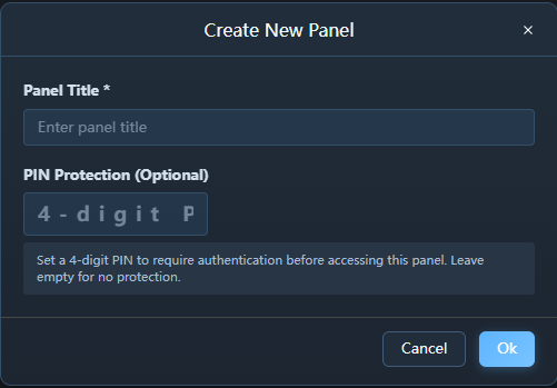
- Fill in the dialog:
| Field | Description | Example |
|---|---|---|
| Title | Panel name shown on the User View tab | Main Stage Controls |
| Colour | Accent colour for the tab | #ff9d00 (amber) |
| Description | Optional subtitle shown in the panel header | Controls for the opening act |
| PIN | Optional 4-digit PIN to lock the panel (leave empty for no protection) | 1234 |
- Click OK.
The new panel appears as a card in the operator's panel grid. Panels with a PIN display a 🔒 lock icon next to their title.
Panel URL slug — Exaplay automatically generates a URL-friendly slug from the panel title. A panel titled
Main Stage Controlsis accessible at/main-stage-controls_panel.htm. The slug is created when the panel is saved and updates whenever the title changes. If two panels would share the same slug, the second gets a numeric suffix (-2,-3, …).
Tip: Use distinct colours for panels used by different people (e.g. amber for stage manager, blue for lighting operator).
Step 2 — Add Items to the Panel
New in 3.2: the panel editor (designer) is the single entry point for adding new items, so the add-item workflow is consistent for every item type. Playlist (media) buttons are now configurable like every other button — give them a custom name and colour, and override the thumbnail.
Items come from three places in the Control View. In each place, hover over an item to reveal a small + button, then select the target panel from the drop-down.
Adding Cue Buttons
Cues let the end user trigger a specific playback point with a single tap.
- Go to the ▶️ Playback (or Composition & Playlist) tab.
- Expand the composition.
- Hover over a cue button — a + icon appears in its top-right corner.
- Click + → choose the target panel.
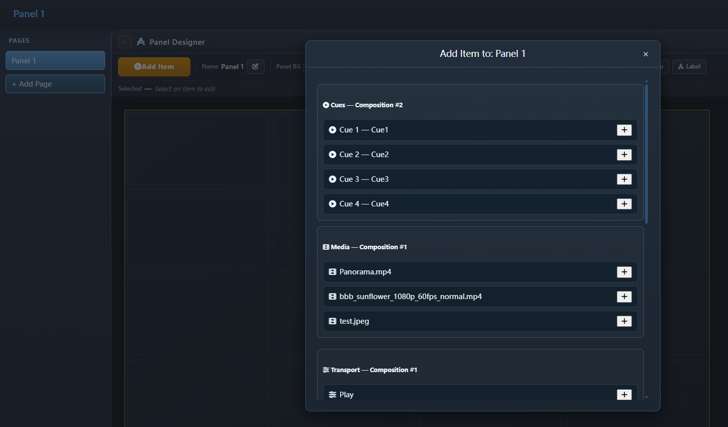
The cue's name and composition are stored so the User View can show a descriptive button.
Adding Custom Controls (Sliders and Number Inputs)
Custom controls let the end user adjust live parameters (opacity, volume, brightness, etc.) that have been previously pinned in the Inspector.
- Go to the 🎚️ Controls (or Custom Control) tab.
- Ensure the parameter is already pinned (see Custom Controls).
- Hover over the pinned control item → click + → choose the target panel.
Master Volume is one click away, but never added for you. A new panel starts empty; the panel editor's Add Item → Custom Controls section always offers a Master Volume fader — the engine's global output level — with no pinning required. The fader follows the engine's live value, so it stays in sync with changes made anywhere else (Control View, show control, the API).
Faders show their level. The filled part of the track is drawn in the item's own accent colour, or the panel's colour if it has none, so a fader can be read from across a room; the number above it is the same colour.
See Custom Controls for a guide on pinning Inspector parameters to the Custom Control tab.
Adding TCP / PJLink Devices
Device items let the end user power projectors and open/close shutters.
- Go to the 📺 Devices (or TCP Devices) tab.
- Hover over a device card → click + → choose the target panel.
Step 3 — Verify the Panel in the User View
Open the User View in a separate browser tab or window:
http://<engine-ip>:8123/userThis dedicated view displays the panel's controls full-screen, with buttons and sliders rendered larger and more clearly than in the main interface — making it well-suited for touch screens or secondary monitors used by operators.
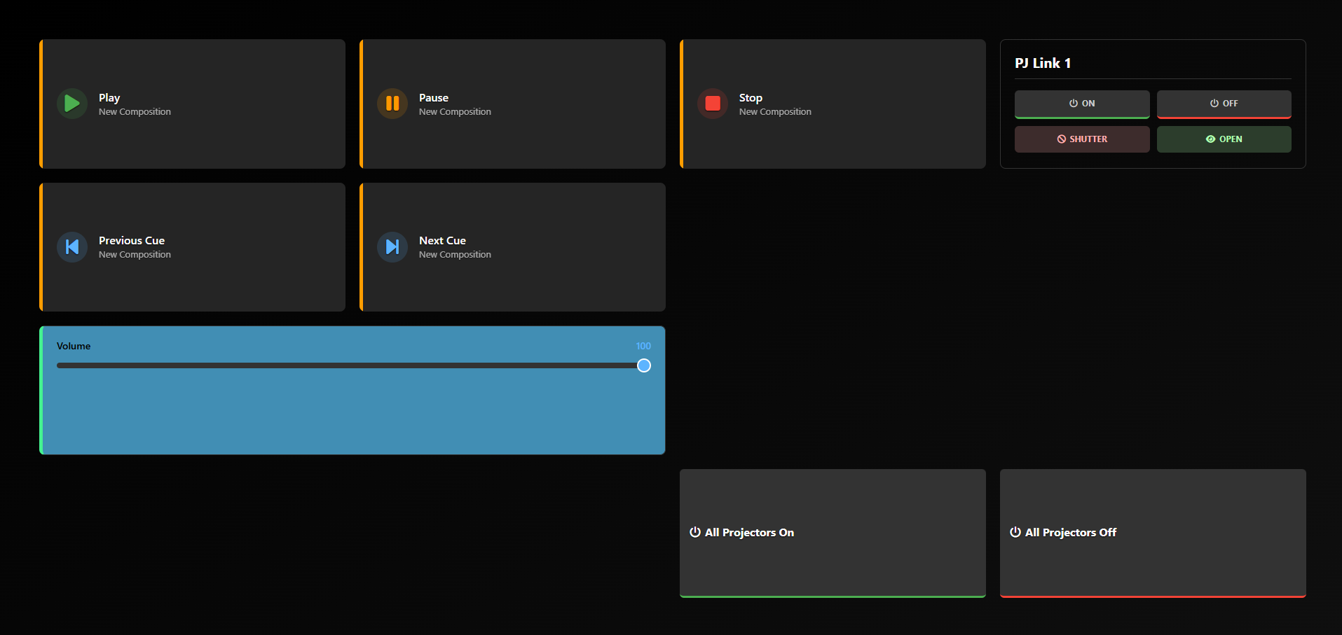
What Each Item Looks Like in the User View
Cue Button

- Tap to fire the cue immediately.
- Shows the cue's name (and the optional second line you give it in the designer). Which composition it belongs to is set — and shown — in the designer's Target field, not on the button.
Range Slider (Custom Control)
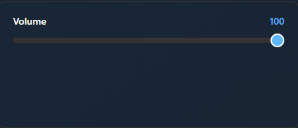
- Drag the slider or type a value to set the parameter live.
- The track is filled up to the current level in the item's accent colour (or the panel's), with the value shown above it in the same colour, so the setting is readable at a glance.
Number Input (Custom Control)
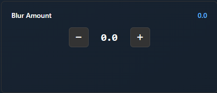
- Press − / + to step the value up or down.
PJLink Device
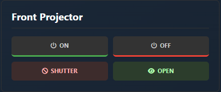
- Power and shutter controls for the configured PJLink projector.
All Projectors On / Off
- One button that powers every configured PJLink projector on or off.
- Executed by the engine against the project's synced device list (
system.pjlink-all=on/off), so the button works from any browser — even one that never opened the Devices tab — and shows how many projectors responded.
Show Mode ON / OFF
- Buttons that switch the global Show Mode on or off — the same state as the Control View header toggle and the external
system.showmode=command. - Added from the System Actions section of the add-item dialog.
Audio Mixer Fader
- A gain fader for one ASIO output channel — the same per-channel gain as the header's Audio Mixer modal.
- Added from the Audio Mixer section of the add-item dialog (the section only appears while an ASIO interface with output channels is active).
- The fader shows the live gain from the engine, so it always matches the Audio Mixer modal and other panels.
- Mixer gains are saved with the project (
.vpp) and restored when the project is loaded — a show reopens with the same channel levels it was saved with.
Separator (Horizontal Rule)
────────────────────────────────────- A horizontal line that visually separates sections of items.
- Added from Admin Mode in the User View via the Add → Separator toolbar button.
- Spans the full width by default.
Spacer (Empty Break)
(empty vertical space)- An empty row that adds vertical space between items.
- Added in the Panel Designer via Add Item → Text & Layout → Spacer (the same dialog that adds cues, media and controls; Label and Page Jump live there too).
- Resize it like any other item — drag its handle in free placement, or change its span on a grid.
The Panel Designer
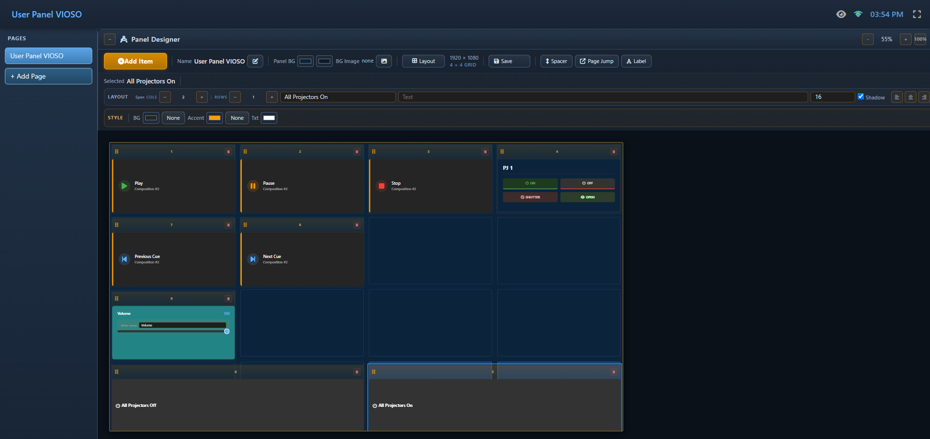
Opening a panel with ?edit=true shows the designer above the canvas. It is deliberately small — one row for the panel, and three lanes for whatever item is selected:
| Row / lane | What is there |
|---|---|
| Panel row | Add Item, the panel Name, Panel BG (two gradient colours and an optional picture), Layout (canvas size, grid or free placement) and Save show with the live save state |
| Layout | The item's Name, its position and size (X / Y / W / H in free placement, column/row span on a grid) and — for a cue, media, transport or page-jump button — what it targets |
| Text | The optional second text line, the text size (dropdown), the font, B / I / AA and alignment as toggle buttons, and the text shadow switch |
| Style | The fill as a colour or a picture (with scale and dim), the text colour, the icon (glyph, placement, size, colour) on every button that draws one — cue, transport, page jump, projector, show mode and system buttons — the play effect and playing/progress colours, drop shadow / glow, and the shape — radius, opacity, border |
Everything else an item can carry (a hover effect, a tooltip, a stacking layer, an accent stripe, an exclusive group) is no longer offered in the designer; panels that already use those values keep rendering them unchanged.
The tile is the only frame. Whatever you set under Style — the fill colour or picture, the radius, the border, the opacity — is the whole item: the colour runs to the tile's edges and there is no second outline inside it. The accent stripe down an item's left edge appears only on an item that was actually given an accent colour.
Saving — panels are part of the show
User panels are stored in the show file (.vpp), not in a separate settings file. While you work, the designer applies every change to the running engine within a couple of seconds — the state next to Save show reads Applied · show not saved then. That is the running show only: an engine restart brings back whatever the show file last carried.
Save show (or Ctrl+S on the panel page) applies the pending panel changes and then saves the show file, exactly like Save in the main window; the state reads Saved to show until the next edit. An untitled show cannot be named from a panel page — save it once from the main window first.
Launching a panel on a display
To have a panel open on a chosen monitor whenever the machine starts — fullscreen kiosk, or an app window at a position and size — use Open on a display… on the panel's card in the Control View → User Panels tab (next to Edit panel). It builds the launch command for Chrome or Edge, lets you copy it, and downloads a .bat you drop into shell:startup on the display machine.
Managing Panels
In the User Panels card grid (Control View → User Panels tab):
Each card shows a thumbnail of the panel itself — the buttons, faders and labels where they really sit, in the panel's own shape and colours — so you recognise a panel at a glance instead of reading a list of element names. Click the thumbnail (or the Edit panel button below it) to open the panel in the designer.
| Action | How |
|---|---|
| Rename / recolour | Click the pencil ✏️ icon on the panel card |
| Copy direct URL | Click the 📋 copy icon on the panel card — copies the panel's pretty URL (e.g. http://192.168.1.5:8123/main-stage-controls_panel.htm) to the clipboard |
| Open in edit mode | Click the 🔗 external-link icon on the panel card — opens the panel directly with Admin Mode available |
| Open on a display | Click Open on a display… on the panel card — creates the launch shortcut (kiosk / app window, position + size) for that panel |
| Delete panel | Click the trash 🗑 icon on the panel card (items are not deleted from the project) |
| Remove an item | Open the panel in the designer (thumbnail or Edit panel), select the item and click the trash 🗑 icon on its card header |
| Reorder panels | Drag panel cards to change order (User View tabs match this order) |
| Reorder items | In the User View, open with ?edit=true query, enable Admin Mode (⊞ icon in header) and drag items to a new position |
| Resize items | In Admin Mode, click S (1 column), M (2 columns), or L (full width) to change an item's grid span |
| Add a label / page jump / spacer | In the Panel Designer, click Add Item and pick it from the Text & Layout section — the new item is selected right away so you can type its text or choose its target page |
| Lock an item in place | Click the padlock on the item's card header (next to duplicate / delete); a locked item cannot be dragged or resized until you unlock it |
| Remove item in User View | In Admin Mode, click the trash 🗑 icon on the item card (also removes from Control View) |
| Add / change PIN | Click the pencil ✏️ icon and set or clear the 4-digit PIN field |
Exclusive Groups
When a panel contains cue or media buttons from different Playlists that target the same output, clicking one button may not produce a visible change because the other Playlist is still playing on top. Exclusive groups solve this by automatically stopping all other compositions in the same group when a new item is triggered.
How It Works
Items that belong to an exclusive group show a small 🔗 badge with the group name — on the panel itself and on the item chips in the Control View → User Panels tab. The group is stored on the item (exclusiveGroup) and travels with the panel; the Panel Designer no longer offers a field for it, so existing groups keep working but new ones are not set from the UI.
When the end user taps a cue button that belongs to an exclusive group, the system:
- Sends a stop command to every other composition in the same group.
- Then fires the selected cue.
This ensures only one composition per group is playing at any time.
Example:

Panel "Stage Content"
├── Cue 1 — Test Pattern    (Playlist A)  → exclusive group: "Main"
├── Cue 2 — Colour Bars     (Playlist A)  → exclusive group: "Main"
├── Cue 1 — Intro Video     (Playlist B)  → exclusive group: "Main"
└── Cue 2 — Loop Video      (Playlist B)  → exclusive group: "Main"

When user taps "Intro Video":
  → Playlist A is stopped automatically
→ Playlist B plays "Intro Video"Note: Exclusive groups only affect the User View. The operator's Control View and the Editor are not affected.
Tip: Leave the exclusive group empty for items that should play independently without stopping anything else.
PIN Protection
Panels can optionally be locked with a 4-digit PIN. When a user navigates to a protected panel, a keypad lock screen appears — the panel content is hidden until the correct PIN is entered.
- Set a PIN during panel creation or by editing the panel (pencil icon).
- Clear the PIN by removing all digits from the PIN field and saving.
- Session memory — once unlocked, the panel stays accessible for the current browser session. Refreshing the page re-locks it.
Note: The User View is a standalone interface — it has no "back" link to the operator or editor views. Each User View tab opens in its own browser window, keeping the operator controls separate from end-user controls.
Sharing the User View
The User View is a standard web page — no software installation required on the end user's device.
Share this URL to show all panels:
http://<engine-ip>:8123/userDirect Panel URLs (Pretty Links)
Every panel has a dedicated, readable URL based on its title slug. This is the recommended way to share a panel for kiosk or dedicated-device use:
http://<engine-ip>:8123/<panel-slug>_panel.htmFor example, a panel titled Main Stage Controls is available at:
http://192.168.1.5:8123/main-stage-controls_panel.htmTo copy any panel's direct URL, click the 📋 copy icon next to the panel card in the Control View → User Panels tab.
Slug rules: The slug is automatically derived from the panel title — lowercased, spaces and special characters replaced by hyphens, leading/trailing hyphens trimmed. If two panels share the same slug, the later panel gets a numeric suffix (
-2,-3, …). Renaming a panel regenerates its slug.
For best results on a dedicated touchscreen tablet, open the URL in kiosk mode (e.g. Chrome --kiosk flag):
http://192.168.1.5:8123/main-stage-controls_panel.htmLegacy Query Parameter
The ?panel=<title> query parameter is still supported for backward compatibility:
http://<engine-ip>:8123/user?panel=Main%20Stage%20ControlsBoth formats open the same panel. Prefer the pretty URL format for new bookmarks and kiosk configurations.
Editing vs. Read-Only Links
By default the User View is read-only — end users can trigger items but cannot rearrange or delete them. To enable Admin Mode (reorder, resize, and delete items), add ?edit=true:
| Link | Purpose |
|---|---|
http://<engine-ip>:8123/main-stage-controls_panel.htm | End-user link — no editing controls |
http://<engine-ip>:8123/main-stage-controls_panel.htm?edit=true | Admin link — shows the Admin Mode toggle for reordering, resizing, and deleting items |
http://<engine-ip>:8123/user?edit=true | Admin link for the full panel list view |
Persistence
Panel configurations are saved in two places:
| Storage | Purpose |
|---|---|
Browser localStorage | Fast reload — survives browser refresh without waiting for the project |
.vpp project file | Permanent — panels travel with the project when exported and opened on another machine |
Practical Example: Conference Event
Scenario: A product launch with three operators.
| Person | Panel | Items |
|---|---|---|
| Stage manager | "Show Control" (amber) | Go cue buttons for each show segment |
| Lighting tech | "Lighting" (blue) | Brightness slider, colour-temp slider, projector ON/OFF |
| Audio tech | "Audio" (green) | Volume fader for each music track |
- Operator creates three panels in Control View.
- Pins the relevant Inspector parameters for lighting and audio.
- Adds cues to the stage manager panel.
- Each operator opens the User View on their own tablet.
- The stage manager only sees the "Show Control" tab; lighting and audio operators see their own tabs (or use
?panel=to lock to one tab).
When the builder is not enough
The builder covers the common case — cue buttons, faders, device controls, arranged in tabs. When a client wants their own branding, a floor plan, a kiosk layout or wording of their own, build the page yourself: Exaplay serves custom HTML pages from its own web server, and ships a small toolkit so a page of plain HTML and CSS can drive the engine without any JavaScript.
You do not start from a blank file: the Write your own page section at the bottom of this tab generates a complete, working panel from the loaded project — with your real composition, cue and device names already in it — and tells you where to put it.