
Appearance
Custom Controls in the Control Panel
The Custom Controls tab of the Control view collects the values an operator should be able to change during a show, such as an opacity, a volume, an effect amount or a switch. Each one becomes a live control, so the operator changes it without opening the composition editor. You need no code for this.

Why Use Custom Controls?
- Expose only what operators need. Give them a short, labelled set of controls instead of the full editor.
- Change values live. The engine gets each change while you drag, and playback keeps running.
- Build User Panels from them. Every custom control can go onto a User Panel as a large fader, field or button.
The list is part of the show. It is saved in the project file together with everything else, so save the show to keep it.
Adding a control from the Inspector
Values the engine allows to be controlled from outside carry a small link icon (🔗) next to their label in the Inspector.
- Select a clip, layer or composition in Produce & Play so that its properties show in the Inspector.
- Find the value, for example Opacity, Volume, an effect parameter or a switch.
- Hover over the link icon next to its label. A card opens with the value's label, path and type.
- Click Add to Control Panel. A message confirms: 📌 Added to Control Panel!
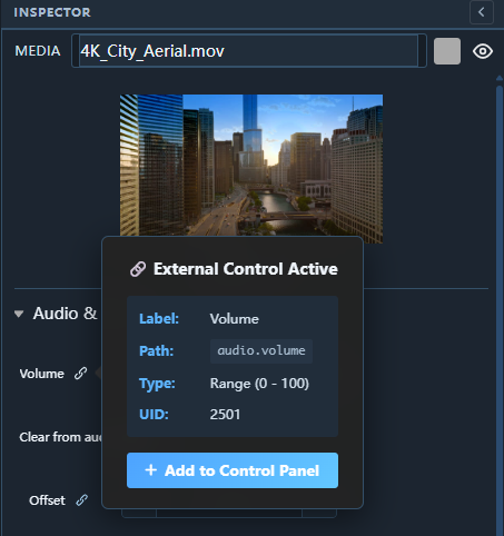
The button toggles. If the value is already in the list it reads Added to Panel with a ✓, and clicking it again removes the value.
Effect and generator parameters work the same way with one click fewer. The link button next to the parameter adds it straight away (tooltip Add to Custom Controls) and turns into a ✓ while it is in the list.
Adding a control from the scene tree
To pick a value without searching for it in the Inspector:
- Open Control → Custom Controls and click Add from scene.
- Choose Smart (the values operators usually need) or Full scene (every controllable value in the project). Type in the filter to narrow the tree, for example
alpha,volumeoreffects. - Select a value. The dialog shows its path, type, current value and range.
- Click Add selected.
The scene tree also offers Play, Pause and Stop for each composition, which gives you action buttons.
Adding a control by its path
If you know where the value lives, click Add from path in the add bar beneath the Custom controls heading. The Add control from path dialog takes the path; Add control adds it:
project.comp1.media3.audio.volumeThe path is the same dotted syntax that the TCP commands, the Monitor's test command and Inputs use: project. (optional), the composition, the elements inside it, then the value. While you type, the field suggests what comes next — compositions, their elements, then their values. ↑ ↓ move through the suggestions, Tab or a click takes one. A path to a number becomes a fader or number field, a path to an on/off value becomes a switch. If the path does not name a value, a message says why and nothing is added.
Command buttons — several commands in one press
A command button runs a list of commands in order, with waits between them if you want: start two timelines at the same moment, or fade one out, wait two seconds and start the next.
- In the add bar beneath the Custom controls heading, click Add command button. The new button is selected and its Inspector opens.
- Under Commands, write one command per line, or click Add with Wizard to add a line with the same Command Wizard you use for a cue's script.
- Give it a Label and press Run to try it.
comp1.play
comp2.play
WAIT>2000
comp3.cue.go=2The lines are the cue-script commands: tree commands such as comp1.play or comp2.cue.go=Blackout, OSC>, TCP>, UDP>, HTTP>, MQTT>, ARTNET> and DALI> messages, and WAIT>milliseconds to pause before the next line (at most 10 minutes per wait). A button holds at most 200 lines.
Walkthrough
☰ menu → Walkthroughs → Playlists & timelines → A cue that sets a value — the Command Wizard shows the Wizard step by step, recorded from the real editor.
Exaplay itself runs the commands, not the browser. A sequence keeps running if you close the panel during a wait, and pressing a button again while it is still running does nothing. In a multi-client setup the master runs it, and the clients follow its playback.
While a button's commands run, Exaplay reports it as running in its status feed (buttons-running), so a Stream Deck key or a control system can light up until the last line, waits included. A second press while it runs is refused.
Command buttons cannot be scheduled. To run commands at a set time, schedule a cue whose script holds them.
Control Types
The kind of value decides the control you get:
| Control | Comes from | What the operator does |
|---|---|---|
| Fader | A slider value (volume, opacity, brightness, …) | Drag the slider or type a number. The range is the value's own range; a 0–1 value (opacity, a mix) reads and types as a percent on the card |
| Number | A number field (position, pixel offset, count, …) | − / + step the value, or type it |
| Pair | A two-value field (size, offset, a crop corner) | One field per value. Both are written together when you commit one |
| Dropdown | A selection | Pick one of the options |
| Text | A text field | Type, then press Enter or leave the field |
| Switch | An on/off value | Tick for On, untick for Off |
| Action button | Play / Pause / Stop of a composition (from the scene tree) | Click to run it on that composition |
| Command button | Add command button (above) | Click to run its list of commands |
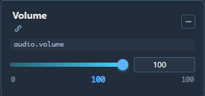

A control writes the value straight into the object it was taken from, in the same way as the Inspector field. An action button runs the composition's own Play, Pause or Stop.
Renaming a control
A new control is labelled after the value (for example "Brightness"). To give it a name the operator understands:
- double-click the label on the control's card, type the new name and press Enter (Esc cancels), or
- select the card and edit Label in the Inspector.
Sorting the controls
The cards sit in a grid in the order they were added. To put them in the order the show needs, drag a card by the grip (⋮ at the left of its name) and drop it on another card: on the card's left half the dragged control lands before it, on the right half after it, and an orange line on that edge shows where. The order is saved with the project, and User Panels are not affected — a panel tile keeps its own place.
The grip is the only part that drags, so a fader inside a card still moves when you pull its thumb.
The Inspector for a control
Click a control card to select it. The Inspector shows:
- Label (editable), Path, Type and, for number values, the Range and step,
- for a fader, number field or switch, the Path is editable: type another path (with the same suggestions as above) and click Apply path. The control keeps its name and its place, and its copies on User Panels follow,
- for a command button, its ID, its Commands, Add with Wizard and Run,
- Remove control — asks first and names the User Panels that hold a copy of this control; the copies go with it.
To drive a value from a script or a page of your own, see the REST API.
Removing controls
| Method | How |
|---|---|
| One control | Select its card → Remove control in the Inspector |
| From the Inspector | Hover the value's link icon → Added to Panel → click to remove (for effect and generator parameters: click the ✓) |
| All at once | Clear all in the Custom Controls header (shown while at least one control exists) |
Removing a control from this list also removes its copies from every User Panel (the dialog names the panels that lose one). A panel from an older project that still carries a copy of a control that no longer exists shows it as missing control; pressing a missing command button says that the project has no such button.
Putting a control on a User Panel
In the Panel Designer, click Add Item. The Custom Controls section lists every control from this tab and also offers Master Volume, the engine's output level, which you do not need to add here first. Add one and it appears on the panel as a large fader, field, switch or button.
A command button becomes a full button on the panel, styled like a cue or transport button: its caption, icon, colour and picture are yours to set in the Designer, and its Commands card there edits the same list of commands this tab shows — one list, wherever you edit it. The section also offers New command button, which adds one here and to the page in one step. A custom web page presses a command button with data-exa-fire="<name>" (Custom web interfaces).
Tips
- Group by name. Prefix the labels, for example "Act 1 — Brightness" and "Act 1 — Volume".
- No Apply button. A fader sends while it moves. Text and pair fields send when you commit them.
- Shared by everyone. The list belongs to the show, so every browser connected to this engine sees the same controls. If two people move the same control, the later value wins.
- Easy Mode hides this tab and the Add to Control Panel button.