
Appearance
User Panel Builder
User Panels are touch-friendly control pages for the people around a show, such as stage managers, hosts, front-of-house staff and AV technicians. They can fire cues, move faders, switch projectors and put the show on air without access to the editor. You build them in the Panel Designer, you manage them in Control → User Panels, and each one opens in any browser at its own address.
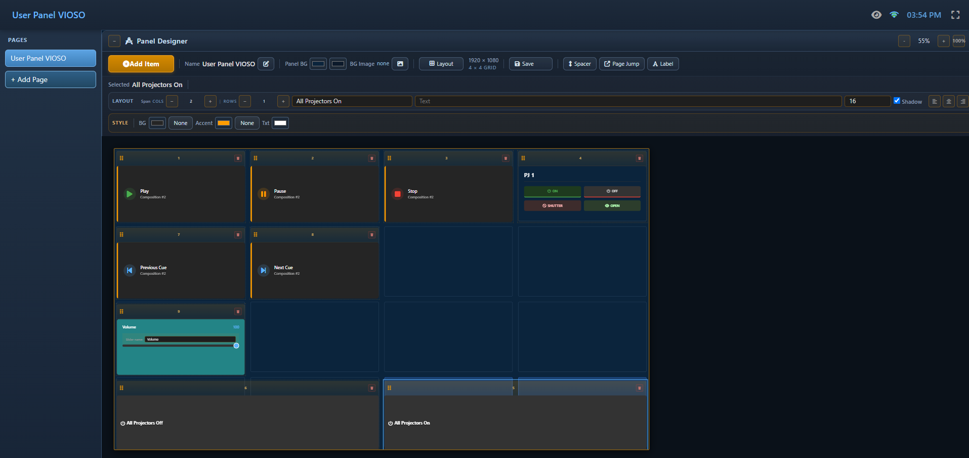
Walkthrough
☰ menu → Walkthroughs → Running the show → A control panel for the front of house builds a panel from scratch: cue buttons, Play and Stop, the master volume, a caption, and Save show.
How It Works (Overview)
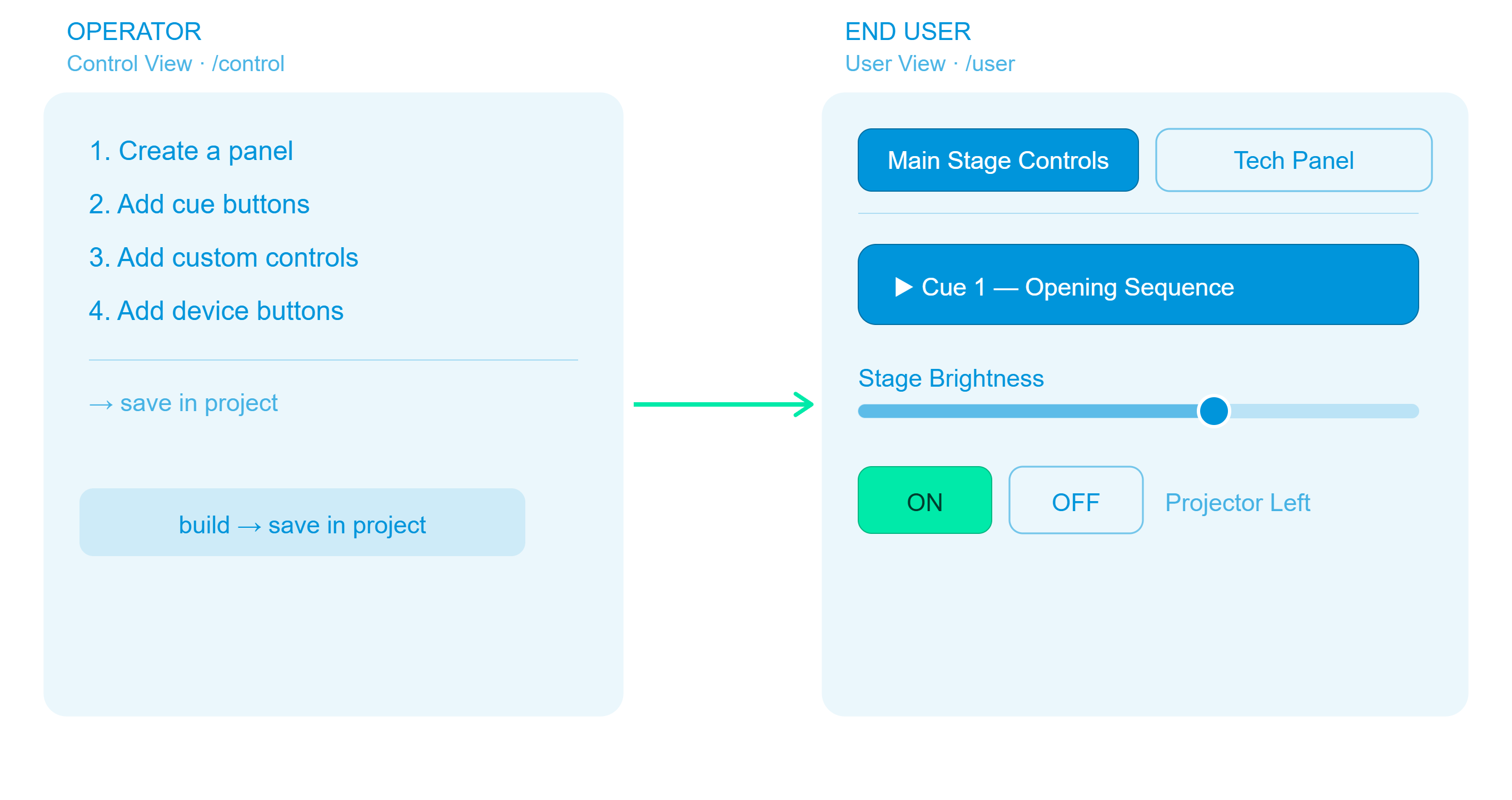
- A panel (also called a page) is one screen of buttons and faders. A show can have as many as you like, and each has its own address and, optionally, its own PIN.
- Every item on a panel is taken from the project: a cue, a clip, a composition's transport, a custom control, a projector, and so on. You pick them from a list and never type an address or a command.
- Panels are part of the show. They are saved in the show file (
.vpp) and travel with it.
Step 1 — Create a panel
- Open the CONTROL tab (or
http://<engine-ip>:8123/control) and switch to User Panels. - Click Create panel (top right of the chip row).
- Enter a Panel Title (up to 50 characters). You can also set a 4-digit PIN here (see PIN Protection).
- Click Create panel in the dialog.
The panel appears as a chip in the row of interfaces and is drawn on its device. Click the picture, or Edit in Designer in the Inspector, to open it in the Panel Designer. The Designer opens right there in the Control tab, under the main header, so Blank and SHOW stay at hand while you work.
An interface is the set of pages an operator moves between on one device (an iPad in the lobby, the operator's monitor). It has one name, one device, one PIN and one address, set in the Control tab's Inspector; each page has its own name and items.
The Designer's top bar has:
- ← User panels: back to the list of panels.
- Preview (eye icon): use the panel the way an operator sees it. Back to edit mode returns to the Designer.
- Focus (expand icon): hides the main header and the tabs so the canvas gets the whole window. Blank and SHOW move into the Designer's bar while Focus is on. Click the icon again, or press Esc, to bring the header back.
If you switch to another tab and come back, the Designer is still open on the same panel.
Inside the Designer, Add Page in the page strip below the canvas creates the next page of this interface (Page 2, Page 3, …) with the same background, device and layout. The strip shows the pages of the interface you are editing; the operator moves between them with Page Jump buttons, whose target list offers this interface's pages first.
Step 2 — Add items
The Panel Designer works like the Stream Deck setup: beside the canvas, the panel Drag onto the panel lists everything the project offers, grouped. Drag an entry onto the canvas and the item lands where you drop it (the cell under the pointer, or the point in free placement); click an entry and the item goes into the next free place. Either way the new item is selected, ready for its text or target. A ✓ marks what the page already has, and a click on such an entry selects it. Find… narrows the list.
Add Item opens the same list as a dialog, with a + per row.
| Section | Items |
|---|---|
| Text & Layout | Label (a text block), Page Jump (a button that opens another page), Spacer (an empty gap); the palette's Text, pictures & layout group also has Picture (a logo or photo — the picture browser opens for it at once). They can be added any number of times, and a new one is selected straight away so you can type its text or pick its page |
| Cues — composition | One button per cue of each Timeline |
| Media — composition | One button per clip of each Playlist, plus Whole playlist (a live thumbnail grid of all its clips) and Upload (a button that adds a file from the viewer's own device to the playlist — offered for an empty playlist too, since that is how a guests' playlist fills) |
| Transport — composition | Play, Pause, Stop, Previous Cue, Next Cue for each composition |
| Custom Controls | Master Volume (the engine's output level, always offered), New command button (adds a command button to the Control tab and to this page in one step, selected so you can write its commands) and every control from the Custom Controls tab |
| Audio Mixer | One gain fader per ASIO output channel. Shown only while an ASIO interface with output channels is active (the Master Volume is under Custom Controls) |
| PJLink Devices | One item per projector, plus All Projectors On and All Projectors Off |
| System Actions | Shutdown / Restart Exaplay Remote PC, Show Mode ON / Show Mode OFF |
| TCP Devices | One item per TCP device |
A new panel starts empty. Nothing is added for you, not even the master volume.
Adding TCP / PJLink Devices
Set up projectors and TCP devices first in Control → TCP Devices (see Projector Control). They then appear in the PJLink Devices and TCP Devices sections of Add Item.
Step 3 — Arrange and style the items
The Designer has the same layout as the Stage. A bar across the top holds the panel's commands, the canvas is in the middle, and an Inspector is docked on the right.
The bar: Add Item · Undo (Ctrl+Z) / Redo (Ctrl+Y) · zoom out / in and Fit · Save show with its state · the palette and Inspector toggles. The canvas fits itself into the space until you zoom by hand, and Fit returns to that.
The device
The canvas is drawn inside the device the panel is for — a monitor on its stand, an iPad, an iPhone — so a button is designed at the size a finger meets it. With nothing selected, the Inspector's Panel card has a Device select: Monitor, Monitor, portrait, iPad, iPhone (each sets the matching size and starter grid) or No frame for a custom size. A panel that never chose is drawn in the frame its size suggests. The frame is only drawn in the designer; the panel page fills the device's screen edge to edge.
Layout: grid or free placement
With nothing selected (click the empty canvas, or the Panel button at the top of the Inspector), the Inspector shows the Panel card: Name, Background (two gradient colours and an optional picture), Device and Layout, and under it the Inactivity return card (see Inactivity return). Click Layout to open the layout settings:
| Setting | What it does |
|---|---|
| Presets | A screen size with a matching starter grid: iPhone 14 Pro, iPad Air, FHD Landscape, FHD Portrait |
| Arrangement | Grid: items sit in rows and columns. Free placement: move and resize items anywhere, with optional Snap to grid |
| Canvas Size | The panel's design size in pixels (width and height) |
| Grid | Columns, rows, cell gap, padding, row height, column width |
On the panel page, the whole canvas is scaled to fit the browser window. On a touch device held the "wrong" way round, the page suggests rotating it.
Moving, resizing and selecting
- Select an item by clicking it. Ctrl+click adds items to the selection.
- Move: drag the item. In a grid the arrow keys move it one cell. In free placement they move it 1 px, and 10 px with Shift.
- Resize: in a grid, set its Columns / Rows span in the Inspector's Layout card. In free placement, drag the handle in its corner or type X / Y / W / H.
- Duplicate, lock (padlock) and delete (trash) are on the item's own header. A locked item cannot be dragged or resized until you unlock it. Delete on the keyboard removes the selected items.
The Inspector for an item
| Card | What is there |
|---|---|
| Layout | Position and size (X / Y / W / H, or the column / row span), and Target: which cue, clip or transport action the button fires, grouped by composition. On a Page Jump it is Jumps to: a page, or Back one page. Cue, clip, whole-playlist and transport buttons also have Group, the exclusive group the button belongs to |
| Text | A Show switch, the caption (what the button says), size, font, B / I / AA, alignment, text colour and a Shadow switch |
| Icon | A Show switch, the glyph, its placement (left / centre / right), size (60 px by default) and colour, and an optional round backdrop with its own colour. Offered on every button that draws an icon: cue, clip, transport, page jump, projector, show mode and system buttons |
| Style | Fill as a colour or a picture (with scale and dim). For a clip button, the thumbnail as Small, Full (behind the whole button) or Off. Play FX (None / Pulse / Scale / Blink) with playing and progress colours, Drop shadow, Glow, Hover feedback on/off, and the shape: radius, opacity, border. For a whole-playlist grid, the tile size and Show names / Show header |
The caption is the button's text. Leave it empty on a cue, clip, playlist or transport button and the button shows the live name from the project again. The target stays the same when you rename.
The tile is the only frame. Whatever you set under Style fills the item to its edges. There is no second outline inside it.
Preview. The eye button in the header shows the panel exactly as the operator will see it. Back to edit mode returns to the Designer. In the Designer itself a button never fires: clicking a Play tile selects it for editing and sends nothing to the engine, so a layout change during a show cannot start anything on the wall. Use Preview to try the panel.
Step 4 — Save the show
Panels are stored in the show file, not in a separate settings file. While you work, the Designer applies every change to the running engine within a couple of seconds. The state next to Save show tells you how far a change has got:
| State | Meaning |
|---|---|
| Unsaved changes / Applying… | The change is on its way to the engine |
| Applied · show not saved | The running show has it. An engine restart would bring back what the show file last carried |
| Saved to show | The show file has it |
| Failed | The engine did not take the change |
Click Save show (or press Ctrl+S on the panel page). It applies pending changes and saves the show file, exactly like Save in the main window. An untitled show cannot be named from a panel page, so save it once from the main window first.
Step 5 — Open the panel where it is used
Every panel has a readable address built from its title:
http://<engine-ip>:8123/<panel-slug>_panel.htmA panel titled Main Stage Controls is at http://192.168.1.5:8123/main-stage-controls_panel.htm. Click the copy icon on the Address row of the Inspector in Control → User Panels to copy the address.
- Slug rules: the title is lowercased, and every run of spaces and special characters becomes one hyphen, with leading and trailing hyphens removed. If two panels would get the same slug, the later one gets
-2,-3, …. - Renaming a panel changes its address, and the old one keeps working. The panel remembers its previous addresses (saved with the show), so a bookmark or a launch shortcut made before the rename still opens that panel and the browser moves on to the new address. Copy the new address when you next edit the shortcut. An address that no panel ever had opens the first panel. If you give a new panel the old name, the address belongs to the new panel from then on.
http://<engine-ip>:8123/useropens the first panel.- The older form
/user?panel=<title>still works and is forwarded to the readable address.
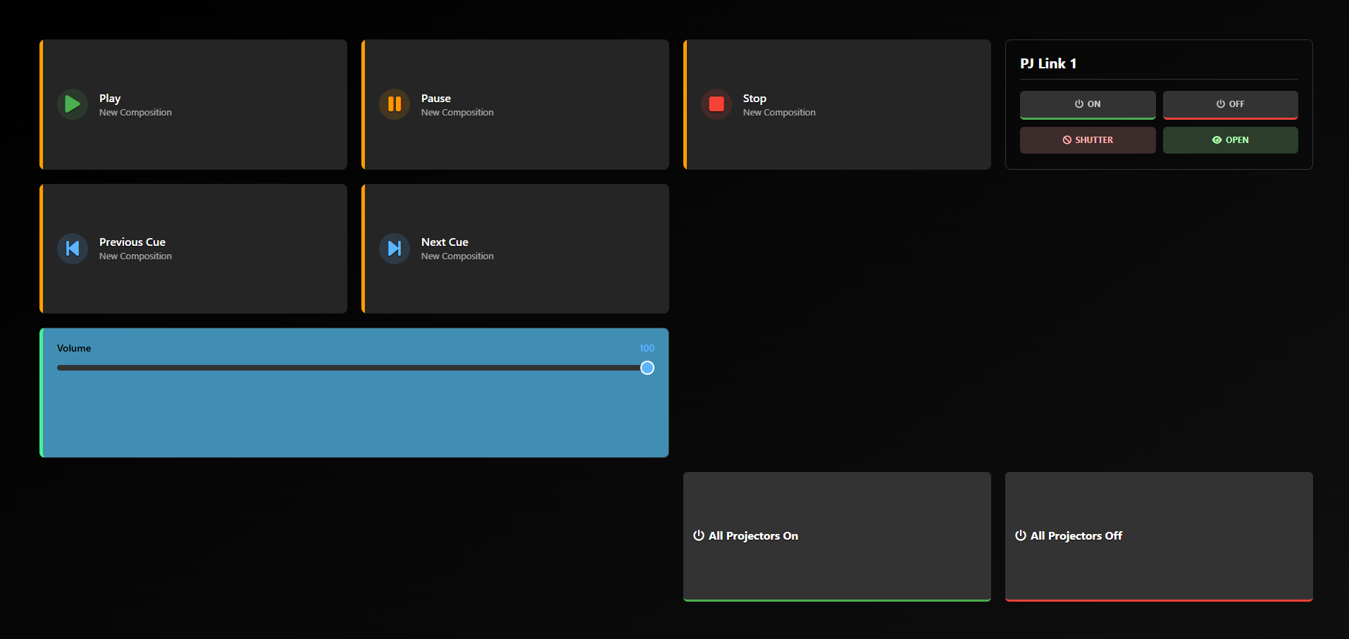
The panel page shows the panel full-screen, with no menu and no link back to the editor. People move between pages only through the Page Jump buttons you give them.
Launching a panel on a screen at startup
To open a panel on a chosen monitor whenever the machine starts, click Open on a display… in the Inspector (Control → User Panels):
- Choose the browser (Google Chrome or Microsoft Edge) and the mode: Kiosk (fullscreen, no browser interface, exit with Alt+F4), App window (no browser interface, exact position and size), Fullscreen browser (F11 to leave) or Window.
- For the windowed modes, set Position X / Y, Width and Height of the target display.
- Copy command to test it in a command prompt, or Download .bat and put the file into
shell:startup(Win+R) on the display machine.
Editing vs. operating links
| Link | Purpose |
|---|---|
…/main-stage-controls_panel.htm | For the operator: the panel only, no editing |
…/main-stage-controls_panel.htm?edit=true | Opens the Panel Designer on that panel |
Edit in Designer in the Inspector and the panel's picture in Control → User Panels open the Designer inside the Control tab. The ?edit=true link opens the same Designer on its own page, for example on a second computer.
What each item does
| Item | On the panel |
|---|---|
| Cue button | Fires the cue in its Timeline, the same as comp1.cue.go=<cue> from outside |
| Clip button | Plays that clip of its Playlist |
| Whole playlist | A live grid of the playlist's clips. Tap a tile to play it. The playing clip and its progress are shown |
| Transport | Play / Pause / Stop run the composition's own verb (as comp1.play). Previous / Next Cue step through the cues. On a Playlist that is not playing yet, Next starts the first cue and Previous the last |
| Fader, field, switch, dropdown (custom control) | Sets the value on the object it came from, live while it moves, exactly as the Inspector field would. The fader's filled track and the number above it are drawn in the item's colour (or the panel's) |
| Action button (custom control) | Runs Play, Pause or Stop on its composition |
| Command button (custom control) | Runs its list of commands — the engine runs them, with the waits between. A full button with a caption, an icon (⚡ unless you pick another) and a colour or picture of its own, styled like a cue button. Its Commands card in the Designer edits the same list the Control tab shows, and Add with Wizard appends a line. The Designer never runs it; use Preview |
| Master Volume | The engine's output level (0–100). It follows the live value, so it stays in step with changes made anywhere else |
| Audio Mixer fader | Gain of one ASIO output channel, the same value as the header's Audio Mixer. Mixer gains are saved with the show |
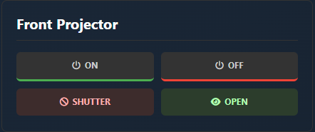
| Projector (PJLink) | ON, OFF, SHUTTER (mute video) and OPEN for that projector. ON or OFF is lit when the engine's power poll last found the projector in that state (Live Power Status) — neither is lit while it is unreachable, warming, cooling or not yet checked |
| All Projectors On / Off | Powers every projector in the project on or off. The engine does it from the project's own device list, so it works from any browser, and reports how many answered |
| TCP device | One Send button, with the device's command shown under it. It sends the command set for the device in Control → TCP Devices, so a change made there applies to the button too. Needs an Exaplay engine version that sends TCP device commands by device |
| Show Mode ON / OFF | Puts the outputs on air or takes them off, the same switch as the header's SHOW ON / OFF and system.showmode=on / =off. On a multi-client rig every client follows |
| Shutdown / Restart Remote PC | Asks for confirmation, then forces the Exaplay PC to power off or reboot |
| Upload | Opens the device's file picker. The chosen file is sent to the Exaplay PC (into Documents\Exaplay Uploads, never replacing a file that is already there) and appended to the end of the button's playlist. The button shows the progress; a toast names the file and the playlist when it is in. In the Designer the Upload card sets the Playlist, which kinds it Takes (video, pictures, audio — at least one), the Max size in MB, and Play right away, which starts the new clip as soon as it is in the playlist. A file of another kind or over the size is refused before anything is sent. Anyone who can open the page can add to the playlist, so put such a page behind a PIN or on a network you control. Needs a master or standalone engine; a client engine does not accept playlist edits |
| Page Jump | Opens another page, or Back one page |
| Label / Spacer | Text, or empty space |

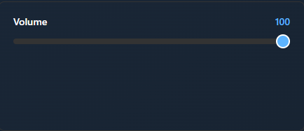
If a button's cue, clip or composition is deleted from the project, its Target in the Designer reads (missing target). Pick a new one.
PIN Protection
A panel can be locked with a 4-digit PIN. Anyone who opens it sees a keypad, and the panel stays hidden until the right PIN is entered. The PIN also guards the panel's ?edit=true link.
- Set or change the PIN when you create the panel, or later in the PIN field of the Inspector's Interface card in Control → User Panels.
- Remove it by clearing that field.
- Unlocked until reload. Once entered, the panel stays open in that browser tab until the page is reloaded.
- Per interface. All pages of an interface share its PIN, or none.
The panel PIN is a barrier against casual use, not access control. It is stored in the show, and anyone who can open the Control view can see and change it. It is separate from the interface PIN in Settings → Interface, which locks the editor and the Control view but not User Panels (see PIN Lock).
Exclusive groups
Buttons can share an exclusive group, so that only one of them plays at a time. When a button of a group is tapped, every other composition that has a button in the same group is stopped first. Use it when two Playlists feed the same output and must never play on top of each other.
- A group spans every page. The same group name on two pages is one group: a button on page 2 stops what a button of that group on page 1 started. Every page of every interface counts, so give unrelated panels different group names (for example
Exhibitfor the visitor pages andStafffor the staff panel). - Set it in the Designer: select a cue, clip, whole-playlist or transport button and type a name in Group on the Inspector's Layout card. Buttons with the same name belong together. The field suggests the groups already used on any page.
- Remove it by clearing the field.
- On the canvas the button shows a small 🔗 badge with the group name.
- A transport button takes part only with Play. Pause, Stop and the cue steps stop nothing else.
Inactivity return
For a kiosk: when nobody has touched, clicked or typed on a page for a set time, one of its buttons is pressed for them, for example Play of the idle loop, or a Page Jump back to the start page.
- In the Designer, click the empty canvas to show the Panel card.
- Switch Inactivity return on.
- Set After: the idle time in seconds, from 10 to 3600 (2 minutes to start with).
- Pick the button under Press. Cue, clip, transport and Page Jump buttons of this page are offered. Add the button first if it is not on the page yet.
How it behaves:
- It presses the button exactly like a tap. An exclusive group on that button still stops the other compositions of its group.
- Once per idle period. After the press nothing more happens until somebody uses the page again, so a Page Jump to a page with its own inactivity return does not start a loop.
- Only on the operating page. It never runs in the Designer, and not while a PIN-locked page is waiting for its PIN.
- Each browser counts for itself. Two tablets showing the same page each press the button after their own idle time. That is why only buttons whose repeat does no harm are offered: a second Play of a composition that is already playing, or a second jump to a page, changes nothing.
- The setting is saved with the page. Switch it off to remove it.
Practical Example: Conference Event
Scenario: a product launch with three people at the controls.
| Person | Panel | Items |
|---|---|---|
| Stage manager | "Show Control" | A button per segment cue, Show Mode ON / OFF, Play / Stop |
| Lighting tech | "Projection" | All Projectors On / Off, a projector item per projector, a brightness fader |
| Audio tech | "Audio" | Master Volume, one fader per music clip's volume |
- In Produce & Play, add the brightness and volume values to Custom Controls and give them clear labels.
- In Control → User Panels, create the three panels and fill each through Add Item.
- Give the stage manager's panel a PIN.
- Save show.
- Copy each panel's address to the tablet it belongs on, or use Open on a display… for a fixed screen.
Each person only sees their own panel. There is no list of other panels on the panel page.
On a multi-client rig
Open panels from the master's address. On a client machine the interface is read-only, and panel buttons answer Client mode — editing is not allowed. The Show Mode buttons reach every client through the master.
When the builder is not enough
The builder covers the common case: cue buttons, faders and device controls on one or more pages. When a client wants their own branding, a floor plan, a kiosk layout or their own wording, write the page yourself. Exaplay serves custom HTML pages from its own web server and ships a small toolkit, so a page of plain HTML and CSS can drive the engine without any JavaScript.
Custom HTML pages, the chip after the interfaces in Control → User Panels, lists those pages, and New page there generates a working page from the loaded project with your real composition, cue and device names already in it.