
Appearance
User Panel Builder
The User Panel Builder lets operators create custom, branded control pages for end users — stage managers, directors, AV technicians, event hosts — who need to trigger cues or adjust parameters without access to the full editor.
Every panel is a named, colour-coded page that appears as a tab in the User View (/user). Operators build panels in the Control View; end users interact with them on any browser.
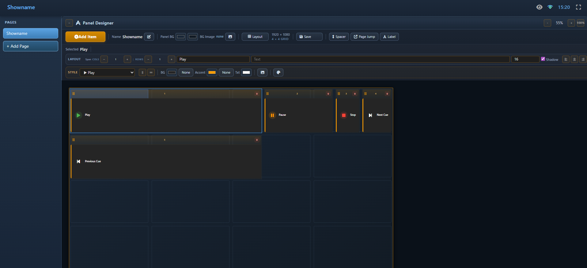
How It Works (Overview)
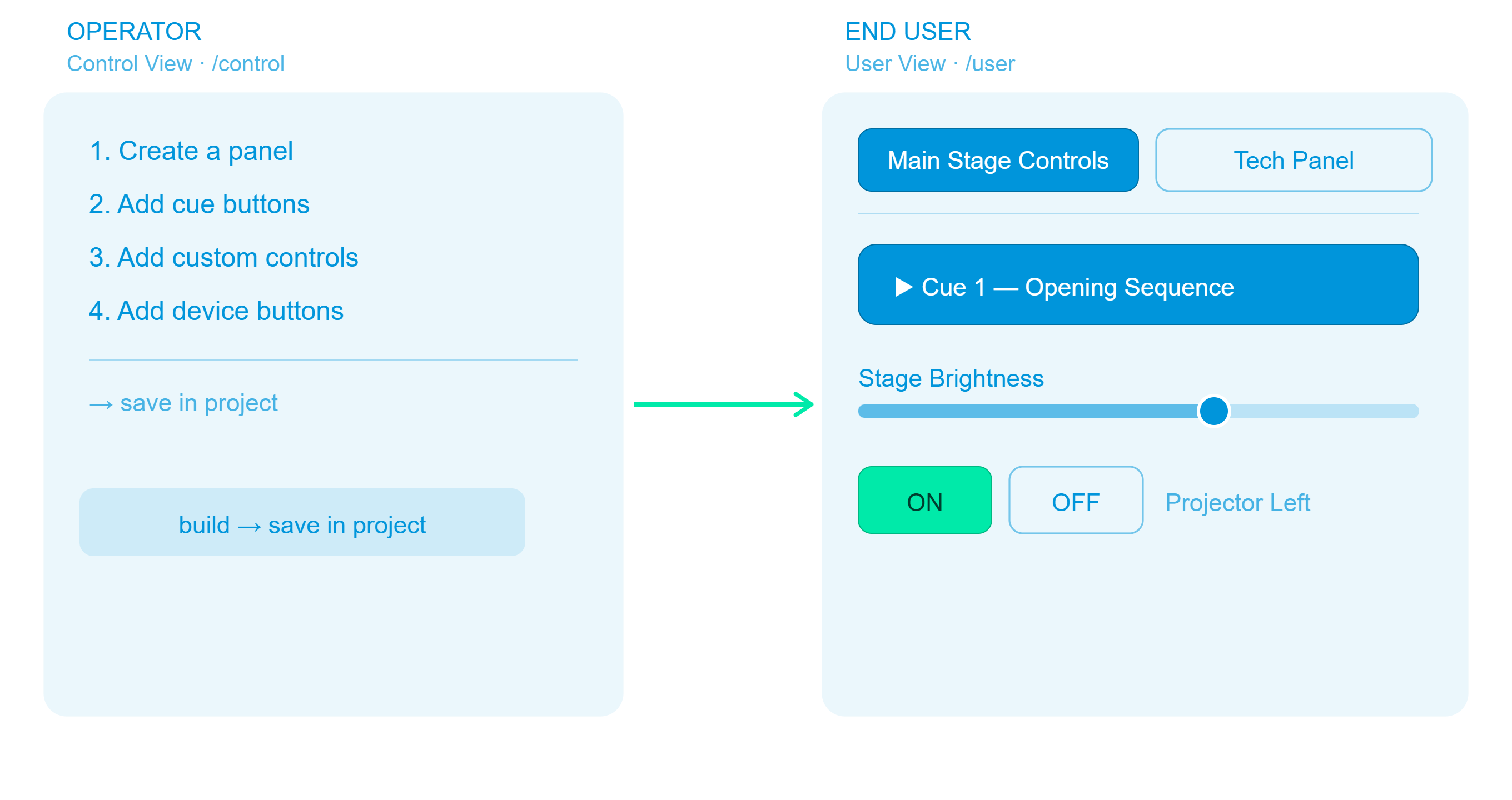
Step 1 — Create a Panel
- Open the Control View (
http://<engine-ip>:8123/control). - Click the 🎨 User Panels tab (labelled Custom Panels in Simple Mode).
- Click + Create Panel.
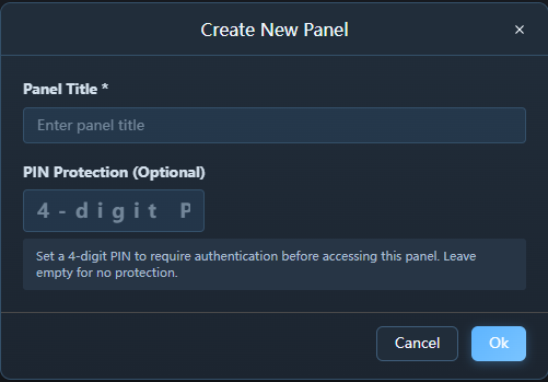
- Fill in the dialog:
| Field | Description | Example |
|---|---|---|
| Title | Panel name shown on the User View tab | Main Stage Controls |
| Colour | Accent colour for the tab | #ff9d00 (amber) |
| Description | Optional subtitle shown in the panel header | Controls for the opening act |
| PIN | Optional 4-digit PIN to lock the panel (leave empty for no protection) | 1234 |
- Click OK.
The new panel appears as a card in the operator's panel grid. Panels with a PIN display a 🔒 lock icon next to their title.
Panel URL slug — Exaplay automatically generates a URL-friendly slug from the panel title. A panel titled
Main Stage Controlsis accessible at/main-stage-controls_panel.htm. The slug is created when the panel is saved and updates whenever the title changes. If two panels would share the same slug, the second gets a numeric suffix (-2,-3, …).
Tip: Use distinct colours for panels used by different people (e.g. amber for stage manager, blue for lighting operator).
Step 2 — Add Items to the Panel
New in 3.2: the panel editor (designer) is the single entry point for adding new items, so the add-item workflow is consistent for every item type. Playlist (media) buttons are now configurable like every other button — give them a custom name and colour, and override the thumbnail.
Items come from three places in the Control View. In each place, hover over an item to reveal a small + button, then select the target panel from the drop-down.
Adding Cue Buttons
Cues let the end user trigger a specific playback point with a single tap.
- Go to the ▶️ Playback (or Composition & Playlist) tab.
- Expand the composition.
- Hover over a cue button — a + icon appears in its top-right corner.
- Click + → choose the target panel.

The cue's name and composition are stored so the User View can show a descriptive button.
Adding Custom Controls (Sliders and Number Inputs)
Custom controls let the end user adjust live parameters (opacity, volume, brightness, etc.) that have been previously pinned in the Inspector.
- Go to the 🎚️ Controls (or Custom Control) tab.
- Ensure the parameter is already pinned (see Custom Controls).
- Hover over the pinned control item → click + → choose the target panel.
See Custom Controls for a guide on pinning Inspector parameters to the Custom Control tab.
Adding TCP / PJLink Devices
Device items let the end user power projectors and open/close shutters.
- Go to the 📺 Devices (or TCP Devices) tab.
- Hover over a device card → click + → choose the target panel.
Step 3 — Verify the Panel in the User View
Open the User View in a separate browser tab:
http://<engine-ip>:8123/userA tab strip at the top shows one tab per panel, colour-coded with the panel's accent colour. Click the panel's tab to see all items in a responsive grid.

What Each Item Looks Like in the User View
Cue Button

- Tap to fire the cue immediately.
- Shows the cue number, name, and composition it belongs to.
Range Slider (Custom Control)
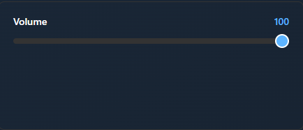
- Drag the slider or type a value to set the parameter live.
Number Input (Custom Control)
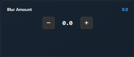
- Press − / + to step the value up or down.
PJLink Device
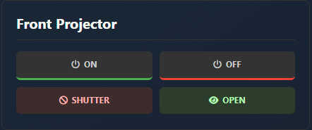
- Power and shutter controls for the configured PJLink projector.
Separator (Horizontal Rule)
────────────────────────────────────- A horizontal line that visually separates sections of items.
- Added from Admin Mode in the User View via the Add → Separator toolbar button.
- Spans the full width by default.
Spacer (Empty Break)
(empty vertical space)- An empty row that adds vertical space between items.
- Added from Admin Mode in the User View via the Add → Spacer toolbar button.
- Spans the full width by default. Resize with S / M / L to control the gap width.
Managing Panels
In the User Panels card grid (Control View → User Panels tab):
| Action | How |
|---|---|
| Rename / recolour | Click the pencil ✏️ icon on the panel card |
| Copy direct URL | Click the 📋 copy icon on the panel card — copies the panel's pretty URL (e.g. http://192.168.1.5:8123/main-stage-controls_panel.htm) to the clipboard |
| Open in edit mode | Click the 🔗 external-link icon on the panel card — opens the panel directly with Admin Mode available |
| Delete panel | Click the trash 🗑 icon on the panel card (items are not deleted from the project) |
| Remove an item | Open the panel preview card, hover over the item, click × |
| Reorder panels | Drag panel cards to change order (User View tabs match this order) |
| Reorder items | In the User View, open with ?edit=true query, enable Admin Mode (⊞ icon in header) and drag items to a new position |
| Resize items | In Admin Mode, click S (1 column), M (2 columns), or L (full width) to change an item's grid span |
| Add separator / spacer | In Admin Mode, use the Add toolbar at the top of the panel to insert a horizontal rule or empty spacer row |
| Remove item in User View | In Admin Mode, click the trash 🗑 icon on the item card (also removes from Control View) |
| Add / change PIN | Click the pencil ✏️ icon and set or clear the 4-digit PIN field |
Exclusive Groups
When a panel contains cue or media buttons from different Playlists that target the same output, clicking one button may not produce a visible change because the other Playlist is still playing on top. Exclusive groups solve this by automatically stopping all other compositions in the same group when a new item is triggered.
How It Works
- In the Control View → User Panels tab, each cue, media, or transport item chip shows a small 🔗 link icon.
- Click the icon to open the Exclusive Group dialog.
- Enter a group name (e.g.
Screen1,Main,OutputA). - Assign the same group name to all items whose compositions should be mutually exclusive.
When the end user taps a cue button that belongs to an exclusive group, the system:
- Sends a stop command to every other composition in the same group.
- Then fires the selected cue.
This ensures only one composition per group is playing at any time.
Example:

Panel "Stage Content"
├── Cue 1 — Test Pattern    (Playlist A)  → exclusive group: "Main"
├── Cue 2 — Colour Bars     (Playlist A)  → exclusive group: "Main"
├── Cue 1 — Intro Video     (Playlist B)  → exclusive group: "Main"
└── Cue 2 — Loop Video      (Playlist B)  → exclusive group: "Main"

When user taps "Intro Video":
  → Playlist A is stopped automatically
→ Playlist B plays "Intro Video"Note: Exclusive groups only affect the User View. The operator's Control View and the Editor are not affected.
Tip: Leave the exclusive group empty for items that should play independently without stopping anything else.
PIN Protection
Panels can optionally be locked with a 4-digit PIN. When a user navigates to a protected panel, a keypad lock screen appears — the panel content is hidden until the correct PIN is entered.
- Set a PIN during panel creation or by editing the panel (pencil icon).
- Clear the PIN by removing all digits from the PIN field and saving.
- Session memory — once unlocked, the panel stays accessible for the current browser session. Refreshing the page re-locks it.
Note: The User View is a standalone interface — it has no "back" link to the operator or editor views. Each User View tab opens in its own browser window, keeping the operator controls separate from end-user controls.
Sharing the User View
The User View is a standard web page — no software installation required on the end user's device.
Share this URL to show all panels:
http://<engine-ip>:8123/userDirect Panel URLs (Pretty Links)
Every panel has a dedicated, readable URL based on its title slug. This is the recommended way to share a panel for kiosk or dedicated-device use:
http://<engine-ip>:8123/<panel-slug>_panel.htmFor example, a panel titled Main Stage Controls is available at:
http://192.168.1.5:8123/main-stage-controls_panel.htmTo copy any panel's direct URL, click the 📋 copy icon next to the panel card in the Control View → User Panels tab.
Slug rules: The slug is automatically derived from the panel title — lowercased, spaces and special characters replaced by hyphens, leading/trailing hyphens trimmed. If two panels share the same slug, the later panel gets a numeric suffix (
-2,-3, …). Renaming a panel regenerates its slug.
For best results on a dedicated touchscreen tablet, open the URL in kiosk mode (e.g. Chrome --kiosk flag):
http://192.168.1.5:8123/main-stage-controls_panel.htmLegacy Query Parameter
The ?panel=<title> query parameter is still supported for backward compatibility:
http://<engine-ip>:8123/user?panel=Main%20Stage%20ControlsBoth formats open the same panel. Prefer the pretty URL format for new bookmarks and kiosk configurations.
Editing vs. Read-Only Links
By default the User View is read-only — end users can trigger items but cannot rearrange or delete them. To enable Admin Mode (reorder, resize, and delete items), add ?edit=true:
| Link | Purpose |
|---|---|
http://<engine-ip>:8123/main-stage-controls_panel.htm | End-user link — no editing controls |
http://<engine-ip>:8123/main-stage-controls_panel.htm?edit=true | Admin link — shows the Admin Mode toggle for reordering, resizing, and deleting items |
http://<engine-ip>:8123/user?edit=true | Admin link for the full panel list view |
Persistence
Panel configurations are saved in two places:
| Storage | Purpose |
|---|---|
Browser localStorage | Fast reload — survives browser refresh without waiting for the project |
.vpp project file | Permanent — panels travel with the project when exported and opened on another machine |
Practical Example: Conference Event
Scenario: A product launch with three operators.
| Person | Panel | Items |
|---|---|---|
| Stage manager | "Show Control" (amber) | Go cue buttons for each show segment |
| Lighting tech | "Lighting" (blue) | Brightness slider, colour-temp slider, projector ON/OFF |
| Audio tech | "Audio" (green) | Volume fader for each music track |
- Operator creates three panels in Control View.
- Pins the relevant Inspector parameters for lighting and audio.
- Adds cues to the stage manager panel.
- Each operator opens the User View on their own tablet.
- The stage manager only sees the "Show Control" tab; lighting and audio operators see their own tabs (or use
?panel=to lock to one tab).